Holiday closure notice: Closed 25th, 26th December & 01st January. No other closures.
FREE SHIPPING FOR ONLINE ORDERS OVER $350 *

Soon you will start to see the gradual introduction of a fresh new look for Single Use Dental. We have grown a lot over the past two years and have updated our branding to better reflect who we are and what we are about.
Our aim is to offer you a simple, convenient and sustainable solution. These principles will now be embodied throughout our online platforms, print and electronic presence.
So, what’s changed?
We said goodbye to the complex cube and embraced a clean and clear design. Expect to see this in a number of colour variations. The new palette pays homage to our original colours. We are continuing use of the green, deep and bright blue, however, these will be accompanied by a variety of vibrant and complimentary tones.

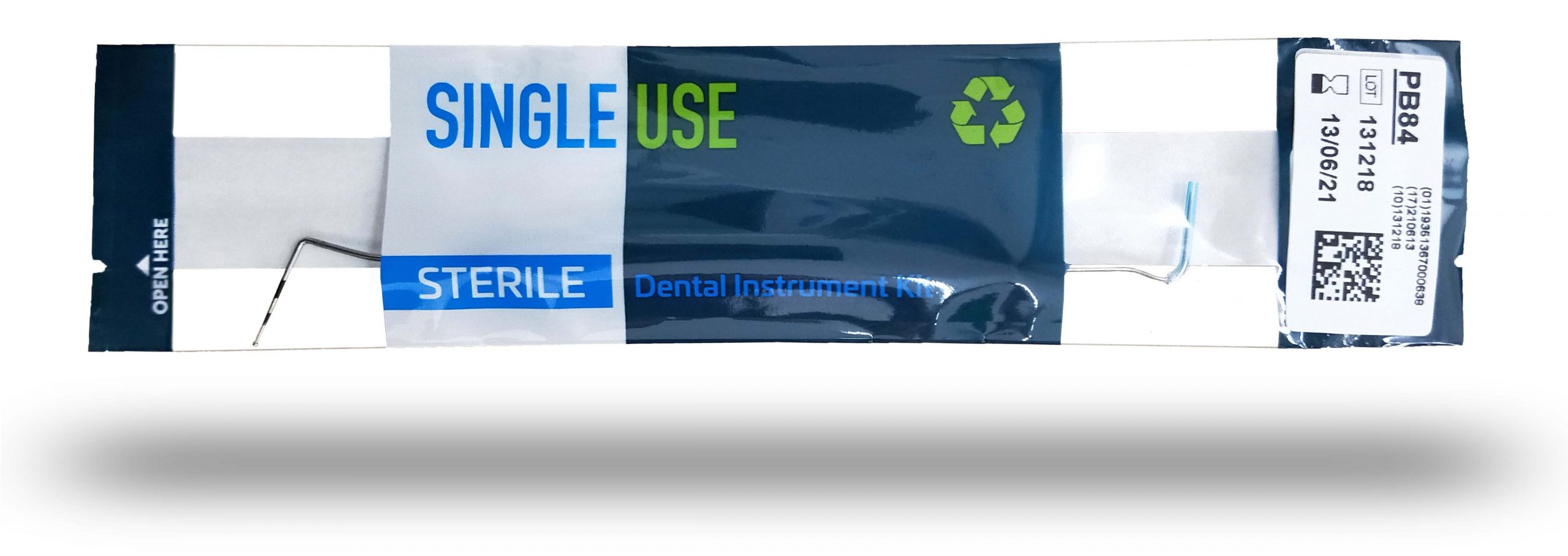
Our product packaging has been refreshed and modified. Scaled back designs help to easily identify vital information. The sleeve designs are sleek and refined, with an additional viewing window for improved instrument visibility. Our dispensers are simplified yet stylish with bold images of our instruments.

We are implementing the GS1 DataMatrix on our instrument sleeves and dispenser labels. The scannable barcodes allow customers to transfer detailed product information directly into patient records. Using this digital communication system is helping the healthcare industry increase patient safety, improve supply chain efficiency, advance the traceability of medicines and devices and support clinical processes.
These and many more exciting changes will start to filter through in the coming months.